It’s OK To Work Outside Of Your Usual Style – From The Archives!

It’s easy to get locked in to a visual merchandising style that you’re good at and know very well. In my case many years ago it was “Minimalism”. This was a super clean style that focused on the product with very little in the way of props. And what props there were would more than likely be styled in a “Repetition” manner. This style also relied on excellent lighting – a good selection of floods, narrow floods, spots and pin spots. At the time that Minimalism started to gain popularity – it received a mixed reception. Some did not like it and was thought to be bland and lazy. Others liked it because of it’s focus on product – especially fashion.

A typical display window of the era utilizing minimalism and repetition as a design strategy.

But sometimes it was fun to break out of that mold and try something different. In my case after several years of mainly using this design discipline at two consecutive retail women’s fashion stores – I wanted to mix things up and see if people were paying attention.

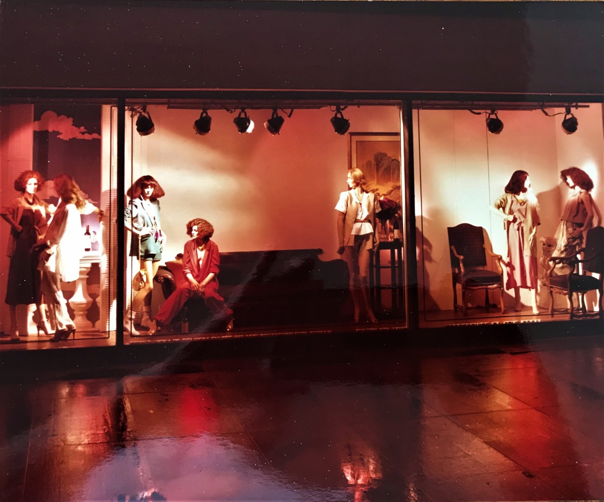
I decided to do a two part display window in the main fashion window utilizing – not only the store’s vast supply of antiques that were used as store decor – but the, new at that time, styrofoam props. The theme of the display window was “A Party”.

This store’s main fashion window was unusually large. It was 30 feet wide and about 6 feet in depth. It was difficult to design for because of it’s size. To fill it up with props would have cost a fortune. Many window displays that I designed for it – as in the first image – I basically just concentrated on the middle 10 feet and just left the rest blank. In this case I utilized the entire 30 feet. There are real antique props – the furniture and art. The window shutters and balustrade are made out of styro-foam and the “clouds” beyond them is a 4′ x 8′ silkscreened image of clouds on foam board. I wouldn’t ordinarily have mixed mannequin vendors but since it was a party scene – I thought that kind of worked with the theme. Also at this time I was covering the entire floor with white vinyl on foam board to give a “blank canvas” to work with my minimal designs but for this window display I removed them to expose the parquet wood floors to give more of a residential appearance.

The display window was an immediate success. Everyone in the store from the executives to the sales people commented first on the different style of the window especially but also – they just liked it. Many of the store’s regular customers also made pleasant comments. The building that the store was in – called “The Hancock” at the time – was a 100 story building in the downtown area and half of the building’s floors were apartments. There were a lot of regular customers in that building.

But – wait – I wasn’t done with this design – remember a “Two Part” display window? After the window’s two week run we installed the second half of the display window.

For the second installment of “The Party” display window we simply left all of the props intact and took all of the mannequins out. We then put in two reclining mannequins decked out in expensive lingerie for the window called “After The Party”. Maybe the girls had a bit too much to drink and knocked over the flower vase? The Fendi shopping bag full of wine bottles and the empty wine glasses tell the rest of the story.

The second part of “The Party” display window was popular too – everyone thought it was a clever idea – except for the sales ladies in the hosiery department. The door to this display window was on the back side of the hosiery department – through a narrow opening in their counter near their cash register. The ladies were so used to us bringing in next to nothing in the way of props – my minimal style – then all of a sudden we were hauling in on these props – including a huge antique sofa. They complained to beat the band – but by the time they had finished complaining – we were done.

By the next display window change I had gone back to my minimalist style – which I loved and the store personnel did as well. It just goes to show that mixing up your style can have some benefits and hones your display design acumen – you can always go back to your comfort zone.

The first display window after “The Party” I went back to a minimalist style that also employed repetition as a design device. As well as antiques the store had a good supply of contemporary furniture – at that time of 1978. These iconic “Wassily” chairs designed by Marcel Breuer in the 1920’s in a rich brown leather were perfect for this “Junior” display window.

*All photographs courtesy of https://jdvincentdesign.com/

Design Inspiration – Don’t Be Afraid To “Lift” An Idea Here And There – But – Make It Your Own – From The Archives!

Design inspiration is nothing new. Who among us hasn’t seen a display window or a store interior display and thought – “What a great idea! – How can I re-interpret that and make it my own”? There’s absolutely nothing wrong with that – but do make it your own. And as far as you know – maybe someone has seen one of your creations and thought/done the same thing.

Maybe you saw a summer display window using just some nautical rope tied to a prop pier with a mock up of a sailboat behind it with a tight group of mannequins in the middle of the design. Well – nautical themes are pretty typical for summer – so re-interpret a different design for a “stylized” sail boat with fabric or foam board and get some authentic life preservers as props and maybe even drape one over a mannequin? See – now you have made it your own design.

And re-interpret not just what you see every day around you – but look towards the past as well. There are many great books on both current visual merchandising ideas as well as books on decades old department store window displays.

This book is by Leonard S. Marcus and was published in 1978. It tells the history of window display from it’s earliest inception up to 1978. It has many great inspirational black and white photos.  It also tells the stories of many talented men and women who worked in this craft/art. It is still available online.

There are so many wonderful pictures in this historical account of the art and business of window display – I could be here all day sharing photographs.

This display window was designed by the legendary Bob Benzio in 1971 for B. Altman in New York. He utilized vintage fans as props. A fan as a prop – not a big deal. But when it is repeated and elevated to different levels – it becomes a thing of art.

I had remembered seeing a picture of this display window around 1975 in the subscription series “Views and Reviews”. I subsequently was inspired to create my own version of it in 1978 – not knowing about this book at that time.

In my version of the fan theme – I purchased common, contemporary oscillating fans from a local hardware store. I also set them on risers. But rather than face them forward I turned their backsides to the front of the display window and aimed them towards the mannequin grouping so the breeze would catch the lightweight designer silk chiffon gowns and blow them in various directions. I wanted to showcase the dichotomy of the inexpensive, everyday, utilitarian fan with the ultra expensive and exclusive designer gowns. As a side benefit a display window was created that was non static – the viewer could stand there and get different views of the gowns as they blew in the breeze. I wasn’t interested in hiding the cords of the fans – I wanted to further the dichotomy by showing the every day aspect of the fans – that everyone could relate to – with the luxury of the gowns.

Sometimes at certain stores I worked at we were given certain props to use and we could interpret how we wanted to use them.

The tried and true prop: over sized tags. In this case for the opening of the Missoni shops nationwide in Bonwit Teller in 1978. In this case Bonwit Teller in Chicago. I used thick rope as the tag string and had the mannequins interact with rope with their stylized poses.

So – in this case I took design inspiration from one of my old windows (but, really,over sized tags are nothing new) – I had special silkscreen over sized tags made for after Christmas sale windows. I also used my brand new Niedermaier columns that I had purchased at the NADI market in New York the previous month. I used the little adorable matching ceramic dogs who could “hold” the end of the tag string. So – don’t be afraid to recycle on of your old window designs also!

A black, red and white color palette theme – with a “suggestion” of a black and white tile floor is utilized with both “off the shelf” props with custom signage.

*All photos courtesy of: https://jdvincentdesign.com/  except The American Store Window

Visual Merchandising With A Black And White Color Scheme Or White On White – From The Archives!

If you’re ever in a pinch for a display design theme – or – because it can be so effective – consider a total black and white color scheme – or even all white. Both are tried and true in visual merchandising story telling.

Now, the obvious consideration is that your product needs to be all black, black and white or all white for this strategy  to work.

Here from my upcoming new book – “More Vintage Visual Merchandising – The 1970’s”-  is an example of a completely black and white color scheme – simple yet effective. A Niedermaier double wide foam board silk screened image of 1970’s super model Sayoko in black and white,with a black vinyl floor pad over a white vinyl floor pad sets off all of the black and white merchandise.

Variations on this can also be all white props and background with all black merchandise on an all white background and white props.

Here – an all white background and floor with white props offset the all black designer dresses – as featured in a previous blog post – https://visualmerchandisingdisplays.wordpress.com/2019/11/08/vintage-visual-merchandising-from-the-archives-a-new-feature/

A variation on this idea can be another effective design scheme – white on white.

Here -in another archive photo –  an all white background, white props and white bridal gowns with good lighting shows how effective a white on white scheme can be. This is also from the same book as the previous photo – https://www.amazon.com/gp/product/B07YK1D3FM/ref=dbs_a_def_rwt_bibl_vppi_i1

In another variation – all white background, floor and props – then use white and colorful merchandise.

Here in this archive photo an all white background – also to be included in my new book – with white flooring and props is utilized to full effect to focus on color and white merchandise.

Actually there are several variations on the black and white theme. Black and white with red is another classic, crisp color scheme that’s bound to attract attention.

Here in a jewelry shadow box style window, a large black and white celebrity poster is set on an all white background that is layered with two foam board panels of glossy red vinyl. The black and white vintage cameras add interest to the design and stay in the overall color scheme.

Really – almost any color would accent a black and white color scheme – especially any bright and vivid color – yellow, orange – make up your own!

*All photos courtesy ofhttps://jdvincentdesign.com/

5 Top Reasons To Not Lay Off A Visual Merchandiser When Sales Are Slow

As sure as there is a sunrise and a sunset, sales will eventually dip in any business no matter how overall successful it is. If that business is retail – they will start slashing non sales staff – sales support (especially Visual Merchandisers)- as a reaction to falling revenues  and the bottom line – or at the very least cut their hours. People – that is exactly the time you should be ADDING onto one of your most valuable staff assets – or at the very least don’t cut any hours.

Just as you are not going to add revenue by turning the thermostat up or down – it’s not going to add onto your bottom line to get rid of your Visual Merchandiser – be it a full time, part time or freelancer. In fact this is just when you should ramp up your visual merchandising efforts. Let your VM get their creative juices flowing and give them some freedom to create a little street drama in your display windows or a traffic stopping front interior display.

#1 – A Visual Merchandiser will keep your store looking fresh and new.

He/She will do this – even without any significant new merchandise – by simply rotating or moving merchandise around. This is especially important if you have many repeat customers. It’s amazing the amount of people and clients who tell me just by moving merchandise around makes the floor look different and increases sales.

If your store has a front entrance display with mannequin forms and nesting tables of merchandise, your VM should have a regular rotation of changing the mannequins and re-folding  the merchandise that represents what those mannequins are wearing.

#2 – A Visual Merchandiser will be quick to pick up on visual merchandising trends and will want to interpret them to your particular product and customer.

A few seasons back this “Runway” style mannequin presentation became popular very quickly. I don’t know who started it but it quickly spread to a variety of retail stores. This is just one example of Visual Merchandisers who are out in the field seeing what the competition is up to and interpreting it for her/his store in a way that’s appropriate for their store.

Related image
This “Runway” style of fashion mannequin display presentation became popular very quickly several seasons ago. This particular image is a wholesale showroom and was found via a Google image search.

#3 – A good Visual Merchandiser always goes back to basics – classic Visual Merchandising strategies – when there may be a momentary lack of a new direction.

Two classic Visual Merchandising strategies that never fail – repetition as a organizing design element and the display pyramid. Repetition as an organizing Visual Merchandising strategy has been discussed here before several seasons back – https://visualmerchandisingdisplays.wordpress.com/2017/04/05/repetition-as-design-discipline/

but it can’t be stressed enough – it just works. The simple fact of just repeating a prop or mannequin or product in a very straight forward manner always has an immediate design impact and catches the eye immediately.

This design for the main back wall of a jewelry repair store of a major Chicago area mall is a classic use of repetition as an organizing design element.

#4 – A good Visual Merchandiser is also a good business person. A good retail or wholesale operation will go beyond their Visual Merchandiser’s hands on creative talent and utilize their business acumen to brainstorm when sales and customer traffic are down.

Case in point as an example – Global Climate Change. Every year it seems there is an early fall weather warm up –  back into the 80’s. This kills business for most retailers – especially apparel stores. Just when stores want customers buying wool sweaters and coats at full price – there’s a heat wave. Customers understandably put off buying anything warm to wear when it’s still warm outside.

If you’re a store owner – meet with your VM and discuss ways to re-route your Visual Merchandising temporarily to accommodate the weather until it goes back to a normal range. For instance – just to get the ideas going – think up some kind of goofy promotion using the weather pattern to lure customers inside – “Free Snow-Cones With Every Wool Sweater Purchase”.   LOL. Rent a mobile Snow-Cone machine for a few days and see what happens. Or something similar – in this day and age you simply can’t sit around and wait for the weather to change.

Image result for snow cone machine
A Google search found this nostalgic Snow Cone machine for sale online.

#5 – Consistency In Branding

Finally – the most obvious reason for not panicking in a market slow down – is simply to maintain your cool and remain On Brand. If you panic and lay off your VM and then the look and the excitement of your store suffers as a result – you will only have given in to temporary market conditions and made the matter worse.

*All photos that are from the internet are noted and no copyright infringement is intended. All others are courtesy of: https://www.jdvincentdesign.com/